Introduction
In this digital world, some texts can still be hard to find. This is a collection of research papers, articles and documents that are relevant for typographic and type design, for students and practitioners alike. While many of these documents are available as pdf and are even sometimes shared in class, there is no shelf where we can reference them easily. Type education is a highly specialised, but also a global effort and this collection may be useful to connect and inform.
Scope
This collection would like to include documents that describe, reflect on or focus on the type design practice. Tool making has been a theme in typedesign, these may have been different in the past, but the size of the discipline has always meant that practitioners were on their own and had to make their own tools and design their own process.
The majority of the science on reading focusses on physiology and psychology, motivated by helping people with reading issues. While absolutely necessary, such research does not always aim to explain why typography works at all. But some of the papers do and those are interesting.
This collection should not duplicate sources that are already available oin the web. In fact, it should reach out to all the archives and collections. It should not be a subset of wikipedia. But some texts need an introduction that connects them to the other documents and themes of the collection. It might be necessary to provide some context for some of the texts. These would not be long academic tracts, but it could be a venue for reflection and perhaps offer the occasional opinion.
Ownership
This collection makes no claims on ownership or copyrights. The curators of this site hope to secure permission from the authors whenever possible. It will not include books and publications that are still in print. But older and rare material, magazine clippings, letters, drawings, etc. will be reproduced with all the references we can find.
Realisation
This collection should be fitted with a small, open source publishing engine, following open web standards and hosted on a public space somewhere. It should allow several editors to contribute. Depending on the engineering requirements, it could be fully static or maybe it needs a database backend. Keywords and in-site references would be very valuable. Bandwidth, hosting and maintenance might incur costs which would need a provision in the budget.
Tools
Search / Indexes / Authors / Keywords / Articles / Sort by / Edit. As you can see this is a theoretical menu for a theoretical website.
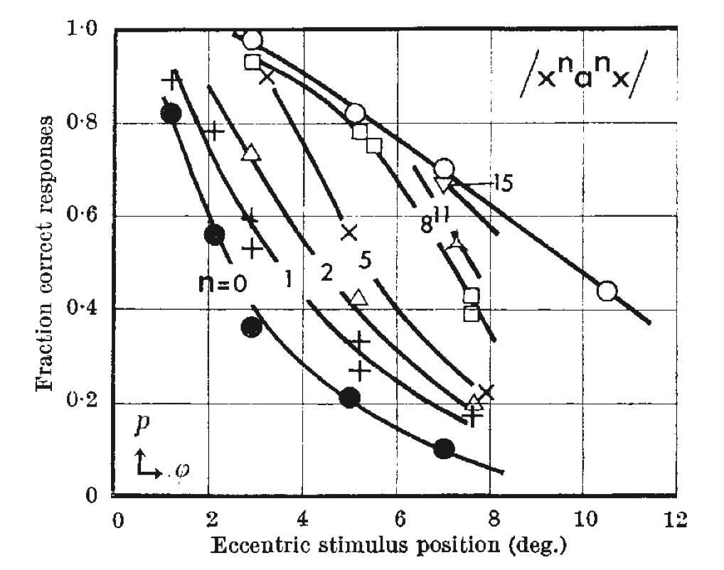
Interaction Effects in Parafoveal Letter Recognition
H. Bouma. Institute for Perception Research (IPO), Eindhoven, Netherlands. NATURE VOL. 226 APRIL. 11 1970, 1970
This is an early investigation of readability and optics. The paper acquired some notoriety.
Received November 12, 1969; revised January 16, 1970.
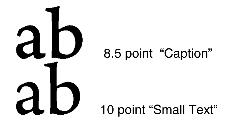
Does print size matter for reading? A review of findings from vision science and typography
Gordon E. Legge, Charles A. Bigelow. Department of Psychology, University of Minnesota, MN, USA. School of Print Media, Rochester Institute of Technology, Rochester, NY, USA Journal of Vision (2011) 11(5):8, 1–22, 2011
An interesting collaboration between type designer Charles Bigelow and Gordon Legge, a psychologist. Together they write sensibly about the science as well as typographic practice.
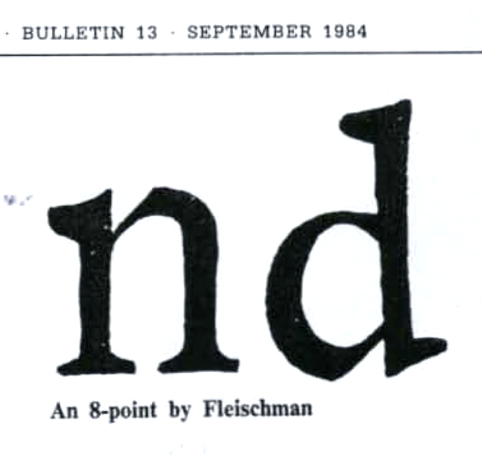
Optical Scale in Typefounding
Harry Carter. Printing Historical Society Bulletin, 13 September 1984, 1984
From the introduction: The article below and on thc next four pages first appeared in Typography 4 of autumn 1937: Typography was edited by Robert Harling. We are grateful to him, and to Matthew Carter, Harry Carter’s son and a member of the Printing Historical Society of which his father was Vice-President, for permission to reprint.
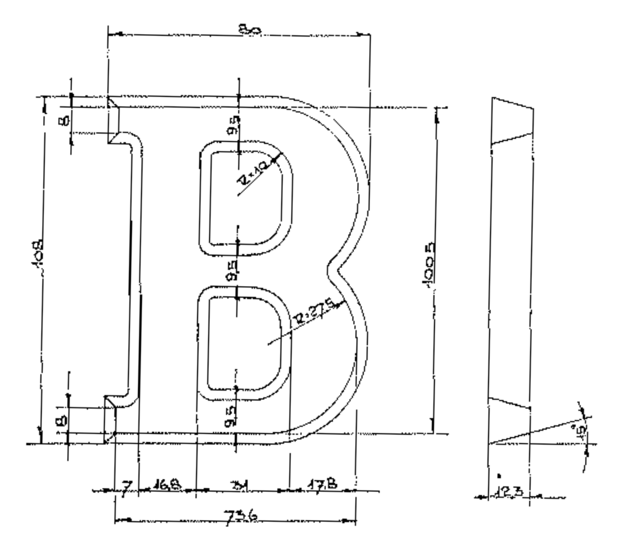
Dutch Chocolate Letters
G.W. Ovink. , 1956
In this article professor Ovink introduced the Dutch traditional chocolate letters to the international readers of Typographica. Gerard Unger loved to refer to this article when he talked about these letters.
Different Approaches to Lively Outlines
Erik van Blokland, Just van Rossum. RIDTII, 1991
Some ideas about the creation of rough and lively outlines in typefaces, how to make them flexible, and control detail levels.
TECHNICAL REPORT No. 136. MetaFont, Metamathematics and Metaphysics
Douglas R. Hofstadter. Computer Science Department, Indiana University, Bloomington, TN 47405, 1982
Abstract: It is argued that readers are likely to carry away from Donald Knuth's article -The Concept of a Meta-Font- a falsely optimistic view of the extent to which the design of typefaces and letterforms can be mechanized through an approach depending on describing letterforms by speCifying the settings of a large number of parameters. Through a comparison to mathematical logic. it is argued that no such set of parameters can capture the essence of any semantic category. Some different ways of thinking about the problem of the -spirit- residing behind any letterform are suggested. connecting to current research issues in the field of artificial intelligence.

LetterLetter 1
Gerrit Noordzij. ATypI, Winter 1984-1985
The first of a series of newsletters written and edited by Gerrit Noordzij on behalf of the ATypI Association Typographique Internationale Committee on Education and Research. LetterLetter aimed to continue the conversations that started at the ATypI working seminars. [more]
LetterLetter 2
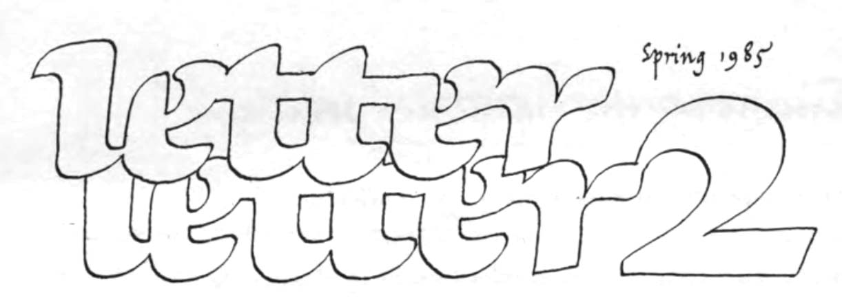
Gerrit Noordzij. ATypI, Spring 1985
Issue 2 of a series of newsletters written and edited by Gerrit Noordzij on behalf of the ATypI Association Typographique Internationale Committee on Education and Research. LetterLetter aimed to continue the conversations that started at the ATypI working seminars. [more]